Logo / Business Cards / Animated Banner / T-Shirts


Stillwater MultiArts Center
Stillwater Multi Arts Center is a great place to explore your creative side. They teach all ages, all skill levels and more types of classes than you might imagine. I love this place, it’s one of those staple businesses within the Stillwater community. I designed the logo as a submission to a contest they were hosting.
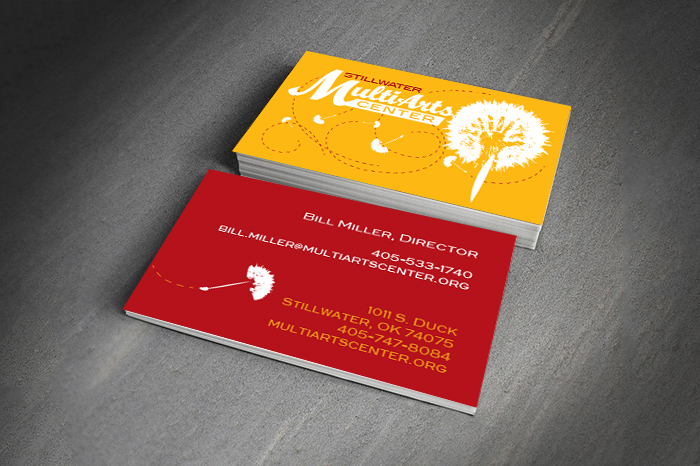
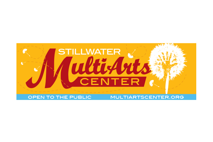
I picked this color scheme because it reminds me of Oklahoma. Golden fields, wood of our trees, red Earth and blue skies. It seems only fitting to use these colors to represent the Stillwater Multi Arts Center since so much of our work is inspired by our land.
This logo has some very important symbols that make it meaningful as well as elements that provide flexibility in adapting to multiple formats.
The graphic symbol is a dandelion pod. I choose this because of what it represents to children – dreams, inspiration & fun. Every child picks these and blows the seeds having similar thoughts and feelings.
The dandelion pod also represents the Stillwater Multi Arts Center and the seeds are the artists, the dreams, the futures and works of its students.
Inside the pod is a hand print because the multi arts is a tactile center. Hand printing is a common childhood practice and was also one of the first marks made inside caves by early man. This is not only a form of art but a human signature, something all artists ascribe to their works.
The addition of the seeds (in executions) allow a whimsical element meant to be different each time.
